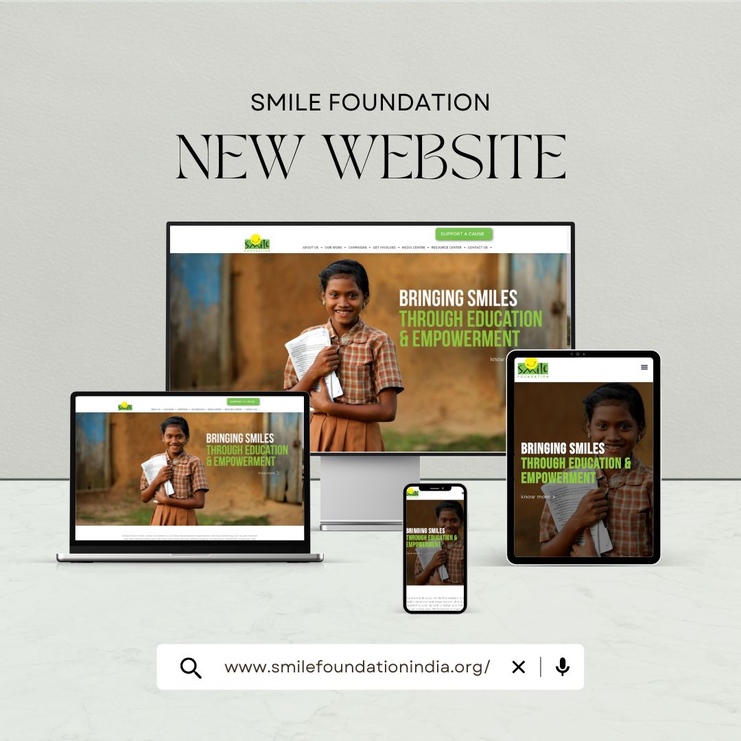
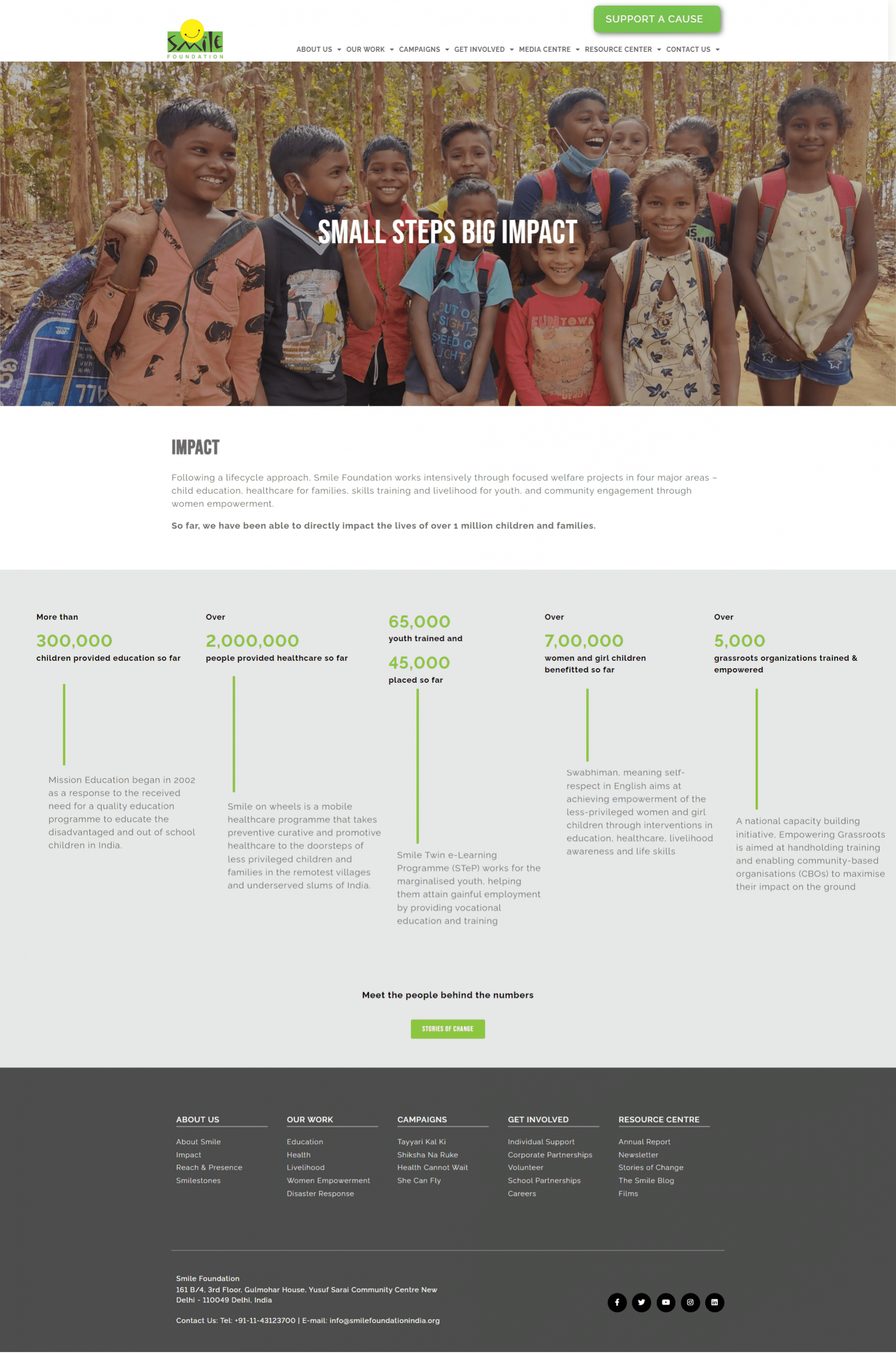
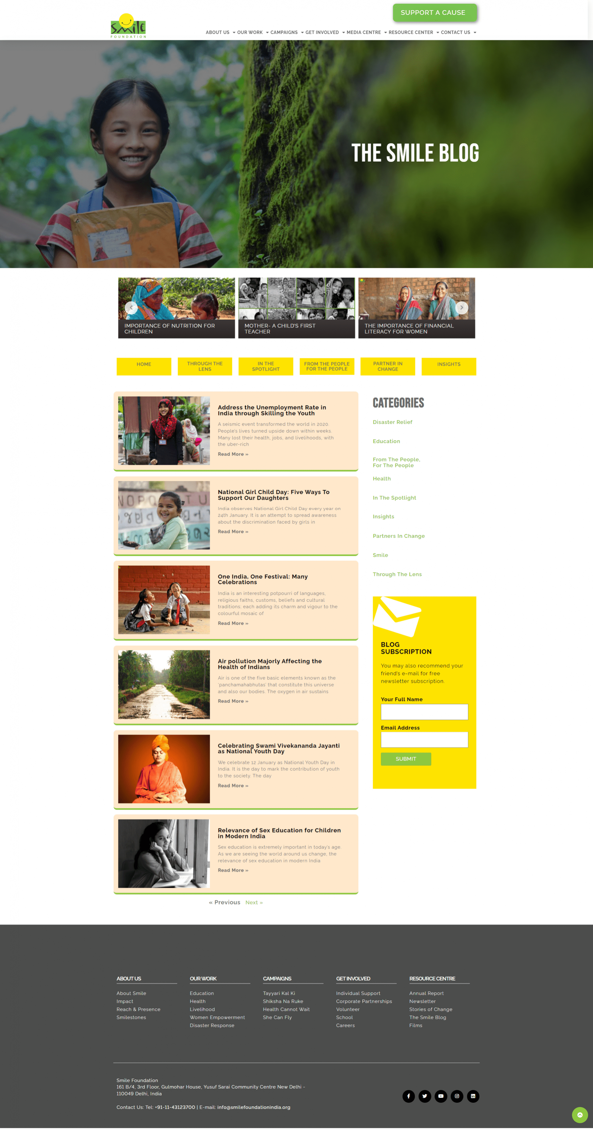
Smile Foundation is a non-profit organization that provides education to women and children who cannot afford to pay educational expenses. They believe in providing quality education to each and everyone so that our country grows and no one is left illiterate. Smile Foundation wanted us to recreate their website with some latest features and technical tools. It was an old and boring website that didn’t meet user experience. Our team at Qodeyard put in all our efforts to build their website in an innovative manner and we were successful in our work. Their website now attracts many visitors and is achieving great heights.
Discovery
Qodeyard was entrusted with developing a digital platform that improved search visibility, boosted brand awareness, and gave users a richer, more intuitive experience because the Smile Foundation’s website lacked uniqueness as well as a distinctive and seamless user experience. Our team developed a thorough website strategy with the goals of strengthening local equity, satisfying users, and enhancing brand recognition. Our team set out to employ content in a more hyper-targeted approach to improve website SEO by building on Smile Foundation’s great performance in local search results. Our strategy’s foundation called for highly optimized local content, so we started by developing area, search-ready web content with its own unique, appealing themes.
We then targeted important business domains using high-impact keywords that directed consumers to specific web pages as part of our premium search strategy. Due to our SEO efforts, Qodeyard was able to assist Smile Foundation in obtaining the top place for relevant google searches, including those for the newsletter page and story page. Our team focused on enhancing the customer experience to make the site more compelling and assisting because, in our business, experience is important. The Qodeyard team began working closely with the Smile Foundation right away, sitting together with designers to discuss the brand and commercial objectives the new website would need to fulfill.
Build
The Smile Foundation had extensive knowledge of what aspects of their website worked and what didn’t. Our task was to take in that information and provide a new viewpoint, utilizing the redesign as a chance to consider the function of the website strategically. A committed development team worked on the site over the span of the weekend and at night to fulfill the short timeline. In the past, websites displayed a potentially overwhelming quantity of features and had a highly deep structure. In order to make it simpler to grasp at a glance what this website wished to convey to its users, we advised arranging all features.
Users could more easily interpret how this website functions and what it aims to contribute to society as a result. In order for Smile Foundation’s new website and marketing campaigns to speak with a collective message, we used our study of the existing creative throughout the site to inspire the development of a consistent design system. That new system was implemented and modified for the web by our site design. It was our responsibility to renew the truly integrated Smile Foundation brand online.
Strategy
The strategy, style, and implementation of a digital platform must all support the same objective, which is to give users a worthwhile, unique time. We design experiences that directly relate to the demands of your target audience and inspire action as well as affection. Our team carefully examined the user experience (UX) of the Smile Foundation website to determine what the site was doing well and where it might be improved. With the help of these revelations, our team redesigned the website as a modern, primary-function brand focused on generating leads. Richer content was added to every page of the website to improve SEO and brand reputation, and new features were made available to prospective customers.
There was far too much stuff on the previous Smile Foundation website. Despite being aware that the Smile Foundation ran the risk of information overload, our team recognized the necessity to update visitors. In order to address this, our copywriters created a new text that considerably compressed those essential details, making it simpler for customers to discover crucial information about the Smile Foundation organization. Real-time comparisons were conducted between various campaign designs, communication, and targeted audience. We were able to gradually improve campaigns because of the information gained from this research, making sure that we were constantly saying the correct things to the targeted audience.
Test & Launch
We thoroughly tested the site on various devices and browsers after all the material had been included and connected to ensure that it was operational and performing properly. The detailed web pages for the different displaying screens were rebuilt, and they are now displayed on a platform that emphasizes the characteristic features of the screens. Users could now investigate why one page would be a good replacement for their needs compared to the other they were considering. It was finally time for the release after months of rigorous effort and planning!
We went through our pre-launch test list to ensure everything was in place and the server was accessible. Since the debut of their new website, all reviews have indicated that users like it. By presenting the essential features of the website in various sections, the content on the homepage promotes investigation. This guides visitors through the remaining pages of the website so they can explore each one. For the best user experience, we carefully matched the design’s look and feel with how each page functioned.
The Results
We felt equipped as a team to tackle the challenge of putting a plan for developing the Smile Foundation’s website into action. But even we were taken aback by the outcomes. Greater exploration and involvement are made possible by Smile Foundation. Now there are no issues with using this website. As more people visit this website due to the positive user experience, their website traffic has improved. The website has a pleasing appearance and all the necessary technological features.
The new Smile Foundation website provides the tool the company needs to expand its business and convert leads into consumers. It now has a significant base digital which is prepared to face the future, whatever that would be, with a long term that is ready for growth. Today’s Smile Foundation website is more vibrant and robust, and effectively communicates the value that motivates this mission-driven business. In terms of visitor quantity and other page metrics, new core content webpages are doing better than the previous ones. The pace of the website has also significantly increased. The connection with Qodeyard for ongoing website development and maintenance will continue. Personalization is a fascinating possibility for Smile Foundation given its extensive collection of content and the large spectrum of prospective customers it may reach. These initiatives have led to a more unified web experience for both new visitors and returning visitors. The organization is now prepared to advance its marketing initiatives with our advice and knowledge.
Final Thoughts
Our team at Qodeyard put in great efforts to rebuild the website of Smile Foundation. The website for the Smile Foundation is now well-developed, and people may enjoy their time there. They are able to have an even more significant impact than before thanks to their new website’s clear development and uncomplicated instructions. Contemporary minimalist and modern designs were introduced along with a solid internal framework that enables admins to make adjustments and users to move fast around the site. The latest features have been added to the website to give it an attractive look. The social work of Smile Foundation is now complemented by an equally potent online presence. Smile Foundation is more than prepared for its moment of fame since they have a promising future ahead of them, which seems only fitting for a team that aims to enable promising lives.


